Perhaps the single most impactful aspect of a web site is its imagery. A site can have a lovely color scheme, clear fonts, and simple navigation, but if the images are blurry, smooshed, or just plain absent a visitor is unlikely to be impressed. On the other hand, most visitors will have tremendous patience with a less-than-beautiful font choice or use of whitespace if there are a few images on the site that make them say, “Wow!”
But images are deceptively difficult to use effectively. First, it takes talent and skill to take beautful photos. That’s why people spend tons of money to hire professional photographers for important events. For your wedding, Aunt Phyllis and her iPhone camera just aren’t going to cut it.
But even if you have several beautiful images composed by a skilled photographer, placing them on a web page in an effective way can be tricky. Sure, it’s easy to sprinkle in a few <img> tags, but if the images we’re working with have different dimensions or aspect ratios, we end up with something like this:1
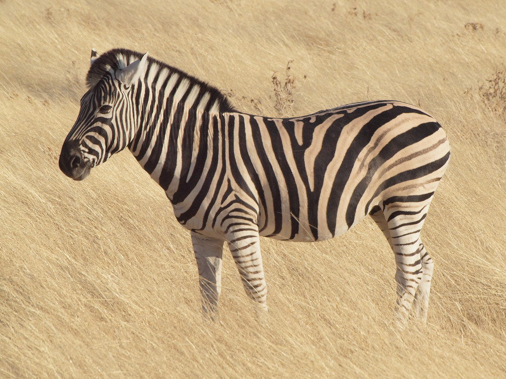
Poor smooshed zebra. Of course, one solution would be to edit each image we use so that it is the size and aspect ratio we need, but this takes time, and what if we need different sizes later? We’d have to re-edit the images.
Isn’t there an easier way? Let me share my favorite technique for using images. It’s guaranteed to preserve the original image’s aspect ratio, while ensuring the image appears with the desired dimensions on your web page. Plus, it’s flexible, making it easy to change the desired dimensions later.
But first, a few definitions.
Image dimensions
Digital images—whether photographs, illustrations, GIF animations, or scalable vector graphics (SVG)—are rectangular by convention. This means that every image has a height and a width, which we call its dimensions.
Image aspect ratio
An image’s aspect ratio refers to the ratio of its width to its height. This is usually expressed as two integers separated by a colon. For example, if an image has a width of 160px and a height of 90px, then its aspect ratio is 160:90, which reduces to 16:9. Note that even though the dimensions were expressed in pixels, the aspect ratio doesn’t have a unit, and so the aspect ratio doesn’t tell you what the actual dimensions of the image are. An image with a 16:9 aspect ratio could be 90px tall or 100px tall or 37.6cm tall.
Also, if the width of an image is equal to its height (i.e. it’s shaped like a square) then the aspect ratio is 1:1, or just 1.
It’s important for web developers to understand aspect ratio because the <img> tag doesn’t. The <img> tag only cares about the actual height and width of the image to display on the screen. If we don’t carefully select this height and width to match the aspect ratio of the image, we end up with smooshed or stretched images, as with the zebra above.
The trick is finding a way to specify the size of an image on a web page without having to worry about its original dimensions2 or even its aspect ratio. Can it be done? Let’s see a way.
Don’t use images. Use windows.
First of all, stop thinking about using “images” on your web page. As we discussed, images have a defined width, height, and aspect ratio, and you may not be able to change those properties. You may or may not even have access to this information for every image you need to use.
So instead of thinking of images on your web page, imagine them as windows. Instead of adding an image to a web page, we’re going to add a window through which we’ll be able to see all or most of the image underneath.
Let’s see how this works with an example. Let’s go back to our zebra pal:
It’s a lovely photo, but we don’t want it to take up our whole webpage. Let’s say we only want it to occupy a wide, thin rectangle that we can insert between two paragraphs. Something about this size:
How can we achieve this without modifying the zebra image? All we need is a little HTML and CSS. Let’s start with an empty div tag:
<div></div>But an empty div tag won’t take up any space on the screen unless we specify its height (and, if necessary, width):
<div style="height: 200px;">
</div>
What we’re going to do is use CSS to apply the zebra photo as a background image:
<div style="height: 200px;
        background-image: url('https://c1.staticflickr.com/3/2753/4301624858_506cd27230_b.jpg');">
</div>
…which results in:
That gets us closer; we can now see part of the zebra, but a lot of the image is cropped off because it doesn’t fit inside our window. We can fix that with a little more CSS:
<div style="height: 200px;
        background-image: url('https://c1.staticflickr.com/3/2753/4301624858_506cd27230_b.jpg');
        background-size: cover;
        background-position: 0 30%;">
</div>
…which gives us:
The background-size: cover tells our browser to cover the div with the background image, even if it has to cut off some of the image. In this case, since our div is a lot narrower than the original image, some of the top and bottom are cut off.
The background-position property allows us to position the image so that we can see the part of the image that we want to see. It can take two values: a horizontal offset followed by a vertical offset.3 In this case, we’re sliding the image up 30% so that we can see the majority of the zebra.
And it’s a good idea to refactor our CSS into a class so we can use it again for other images:
.window {
    background-size: cover;
    background-position: 0 30%;
}
Now all we have to do is apply the class and instance-specific properties to the div:
<div class="window"
    style="height: 200px;
    background-image: url('https://c1.staticflickr.com/3/2753/4301624858_506cd27230_b.jpg');">
</div>
There we go! We get a good view of the zebra without having to worry too much about its dimensions or aspect ratio.
Some caveats
The benefit of this technique is that it relieves the web developer of concern for the dimensions and aspect ratio of images—to an extent. But, in closing, keep in mind a few caveats:
- It can take some finagling to ensure that the part of the image viewable through the window is appropriate and meaningful.
- This technique replaces an
imgtag with adiv, which means our HMTL is a bit less semantic. divtags don’t have thealtattribute, which could be a concern for visually-impaired users. We should find another way to describe or represent the image in text nearby.- Users are unable to right-click and download CSS background images. (Although you may even prefer this behavior.)
-
We are assuming that the image isn’t too big to use on the web. Learn more about optimizing images for the web. ↩
-
The
background-sizeproperty is actually quite complex. Check out this CSS-Tricks article to learn more about it. ↩